サンプル: スペクトル解析
目的
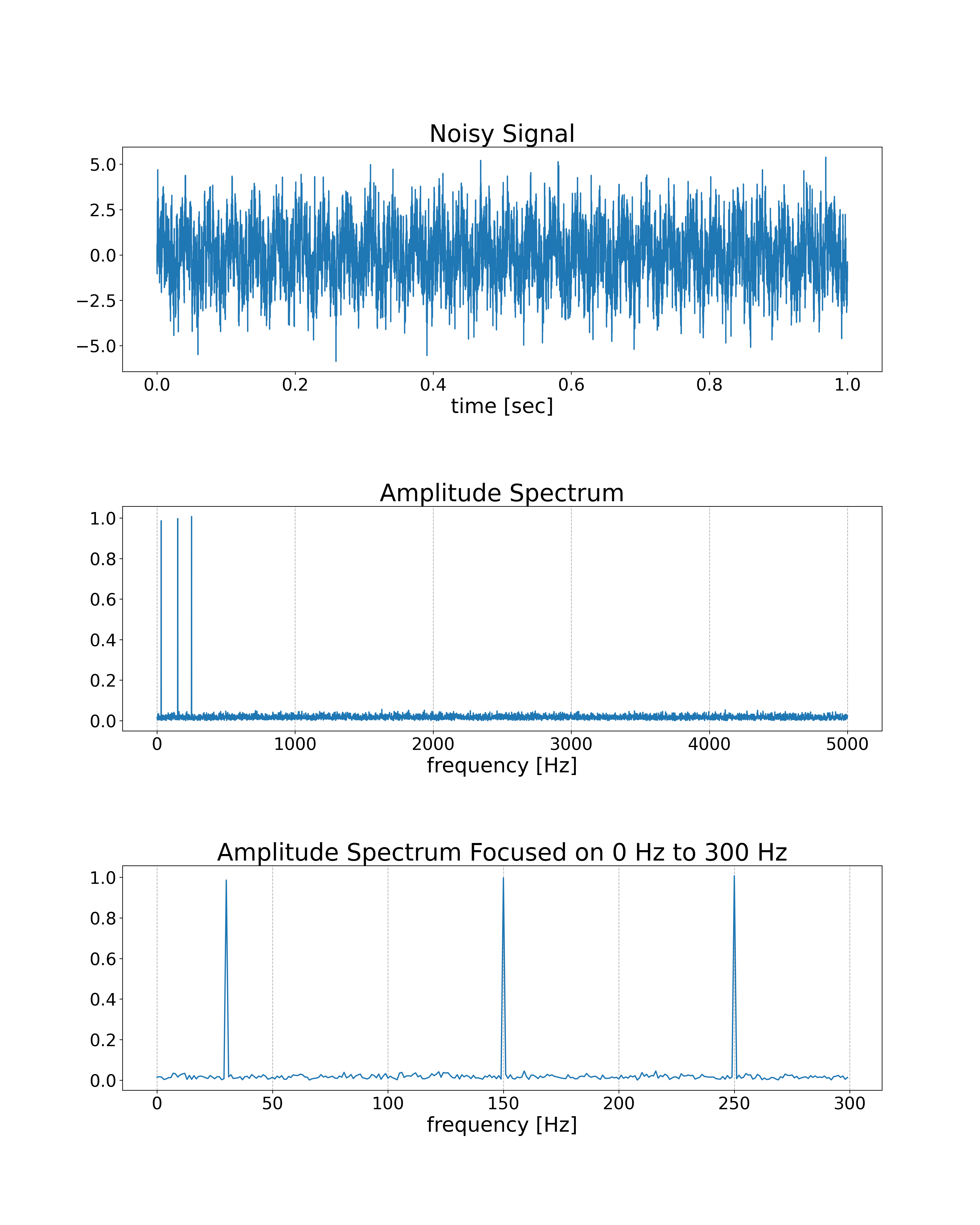
FFTを使用して、ノイズが含まれた信号のスペクトルを解析します。入力信号には、30Hz, 150Hz, および、250Hzの正弦波と正規分布乱数が含まれています。
プログラム
import nlcpy as vp
from matplotlib import pyplot as plt

N  = 10000   # The number of samples
DT = .0001   # The time step interval
FREQS = [    # The list of frequencies to include in the signal
    30,
    150,
    250
]


def gen_signal():
    T = vp.arange(0, N * DT, DT, dtype='f8')
    S = vp.zeros(N, dtype='f8')
    for f in FREQS:
        S += vp.sin(2 * vp.pi * f * T)
    # Add noise
    S += vp.random.randn(N)
    return T, S


def analyze(S):
    A = vp.absolute(vp.fft.rfft(S)) / N * 2
    F = vp.fft.rfftfreq(N, d=DT)
    return A, F


def gen_graph(T, S, A, F):
    fig, axes = plt.subplots(3, 1, figsize=(16, 20))
    axes[0].set_title('Noisy Signal', fontsize=28)
    axes[0].plot(T, S)
    axes[0].set_xlabel('time [sec]', fontsize=24)
    axes[0].tick_params(labelsize=20)

    axes[1].set_title('Amplitude Spectrum', fontsize=28)
    axes[1].plot(F[:], A[:])
    axes[1].set_xlabel('frequency [Hz]', fontsize=24)
    axes[1].grid(axis='x', linestyle='--')
    axes[1].tick_params(labelsize=20)

    axes[2].set_title('Amplitude Spectrum Focused on 0 Hz to 300 Hz', fontsize=28)
    axes[2].plot(F[:300], A[:300])
    axes[2].set_xlabel('frequency [Hz]', fontsize=24)
    axes[2].grid(axis='x', linestyle='--')
    axes[2].tick_params(labelsize=20)

    plt.subplots_adjust(hspace=0.6)
    plt.savefig('spectrum.png', dpi=300)


if __name__ == '__main__':
    T, S = gen_signal()
    A, F = analyze(S)
    gen_graph(T, S, A, F)
結果